A Guide to Using Styled Components with React Native
Effective styling is crucial for creating a user-friendly and visually appealing mobile application. In React Native, styling is typically accomplished using the StyleSheet.create() method to define JavaScript objects that mirror CSS properties.
An alternative and popular approach is to use styled-components, a "CSS-in-JS" library that allows developers to write component-specific styles in a single location using standard CSS syntax. This can be particularly intuitive for developers with a background in web development.
This tutorial provides a comprehensive guide to integrating and using styled-components in a React Native application built with Expo.
What are Styled Components?
Styled Components is a library that enables developers to write CSS code to style components within a JavaScript file. By coupling styles directly with their corresponding components, it enhances developer experience and improves code organization.
While React Native's StyleSheet API is powerful, it follows conventions that can be unfamiliar to web developers, such as using camelCase for property names (e.g., backgroundColor instead of background-color). styled-components bridges this gap by converting standard CSS syntax into React Native stylesheet objects behind the scenes, allowing for a more familiar workflow.
Getting Started: Setup and Installation
To begin, initialize a new React Native project using the Expo CLI.
# Install expo-cli if you haven't already
npm install -g expo-cli

# Create a new project
expo init your-app-name
When prompted, select the "blank" template and choose your preferred package manager (npm or yarn).
Once the project is created, navigate into the directory and install the styled-components library.
cd your-app-name
npm install styled-components
Using Styled Components
Let's modify the default App.js file to use styled-components. Start by importing the library.
import React from 'react';
import styled from 'styled-components';
Next, replace the standard React Native components (View, Text) with custom styled components.
export default class App extends React.Component {
  render() {
    return (
      <Container>
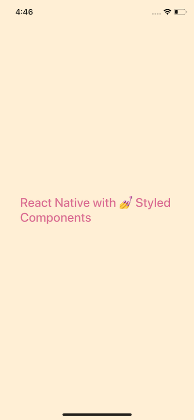
        <Title>React Native with Styled Components</Title>
      </Container>
    );
  }
}
styled-components utilizes tagged template literals to define styles. You create a component by calling styled with a base React Native component (e.g., styled.View or styled.Text) followed by backticks containing standard CSS.
const Container = styled.View`
  flex: 1;
  background-color: papayawhip;
  justify-content: center;
  align-items: center;
`;

const Title = styled.Text`
  font-size: 24px;
  font-weight: 500;
  color: palevioletred;
`;
Notice that we no longer need to import View, Text, or StyleSheet from react-native. The library handles the conversion automatically.
Passing Props to Styled Components
A powerful feature of styled-components is the ability to adapt styles based on props passed to the component. This allows for the creation of reusable and dynamic components.
Create a new file components/CustomButton.js to demonstrate this. The component will accept backgroundColor, textColor, and text as props.
// components/CustomButton.js
import React from 'react';
import styled from 'styled-components';

const CustomButton = props => (
  <ButtonContainer
    onPress={() => alert('Button Pressed!')}
    backgroundColor={props.backgroundColor}
  >
    <ButtonText textColor={props.textColor}>{props.text}</ButtonText>
  </ButtonContainer>
);

export default CustomButton;

const ButtonContainer = styled.TouchableOpacity`
  width: 100px;
  height: 40px;
  padding: 12px;
  border-radius: 10px;
  background-color: ${props => props.backgroundColor};
`;

const ButtonText = styled.Text`
  font-size: 15px;
  color: ${props => props.textColor};
  text-align: center;
`;
By passing an interpolated function (${props => ...}) to the template literal, you can access the component's props and dynamically set style values.
Now, use this CustomButton in App.js:
import CustomButton from './components/CustomButton';
// ...
render() {
  return (
    <Container>
      <Title>React Native with Styled Components</Title>
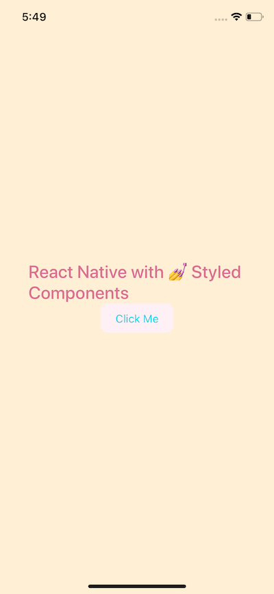
      <CustomButton text="Click Me" textColor="#01d1e5" backgroundColor="lavenderblush" />
    </Container>
  );
}
This will render a button with the specified custom styles.
Example Application: Grocery UI
To further illustrate the power of styled-components, let's build a simple UI for a grocery application.
Titlebar and Avatar
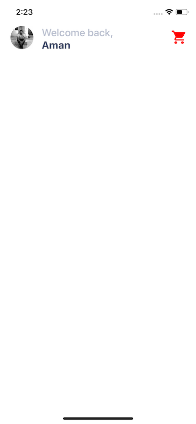
In App.js, create a Titlebar that includes an Avatar image and text elements.
const App = () => (
  <Container>
    <Titlebar>
      <Avatar source={require('./assets/avatar.jpg')} />
      <Title>Welcome back,</Title>
      <Name>Aland Baban</Name>
      <Ionicons name="md-cart" size={32} color="red" style={{ position: 'absolute', right: 20, top: 5 }} />
    </Titlebar>
    {/* ... rest of the app */}
  </Container>
);

const Container = styled.View`
  flex: 1;
  background-color: white;
`;

const Titlebar = styled.View`
  width: 100%;
  margin-top: 50px;
  padding-left: 80px;
`;

const Avatar = styled.Image`
  width: 44px;
  height: 44px;
  border-radius: 22px;
  margin-left: 20px;
  position: absolute;
  top: 0;
  left: 0;
`;
// ... other text styles
Using position: absolute allows precise placement of elements like the avatar and the cart icon within the Titlebar.
Horizontal ScrollView for Categories
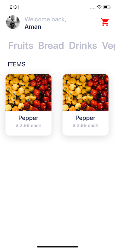
To display a scrollable list of categories, wrap the mapped items in a ScrollView component from react-native and set the horizontal prop to true.
import { ScrollView } from 'react-native';

const items = [{ text: 'Fruits' }, { text: 'Bread' }, /* ... */];

const App = () => (
  <Container>
    <ScrollView>
      {/* ... Titlebar */}
      <ScrollView
        horizontal={true}
        style={{ padding: 20, paddingTop: 30 }}
        showsHorizontalScrollIndicator={false}
      >
        {items.map((category, index) => (
          <Categories name={category.text} key={index} />
        ))}
      </ScrollView>
      <Subtitle>Items</Subtitle>
      {/* ... Item Cards */}
    </ScrollView>
  </Container>
);
Building a Card Component
Create a reusable Card.js component to display individual grocery items. This component will use styled View, Image, and Text elements to structure its content.
// components/Card.js
const Card = props => (
  <Container>
    <Cover>
      <Image source={props.image} />
    </Cover>
    <Content>
      <Title>{props.title}</Title>
      <PriceCaption>{props.price}</PriceCaption>
    </Content>
  </Container>
);

const Container = styled.View`
  background: #fff;
  height: 200px;
  width: 150px;
  border-radius: 14px;
  margin: 18px;
  box-shadow: 0 5px 15px rgba(0, 0, 0, 0.15); /* Note: box-shadow is iOS only */
`;

const Cover = styled.View`
  width: 100%;
  height: 120px;
  border-top-left-radius: 14px;
  border-top-right-radius: 14px;
  overflow: hidden;
`;
// ... other styles
These cards can then be arranged in a two-column layout within the main App.js component.
Conclusion
styled-components offers a powerful and intuitive way to style React Native applications, particularly for developers familiar with standard CSS. It promotes a clean, component-based architecture by co-locating styles with their respective components, leading to more maintainable and reusable code. While React Native's built-in StyleSheet API is perfectly capable, styled-components provides a compelling alternative that can streamline the development workflow.